Practical guide · Dale Spoonemore
Getting better UI out of AI with image generation
Adapted here: .
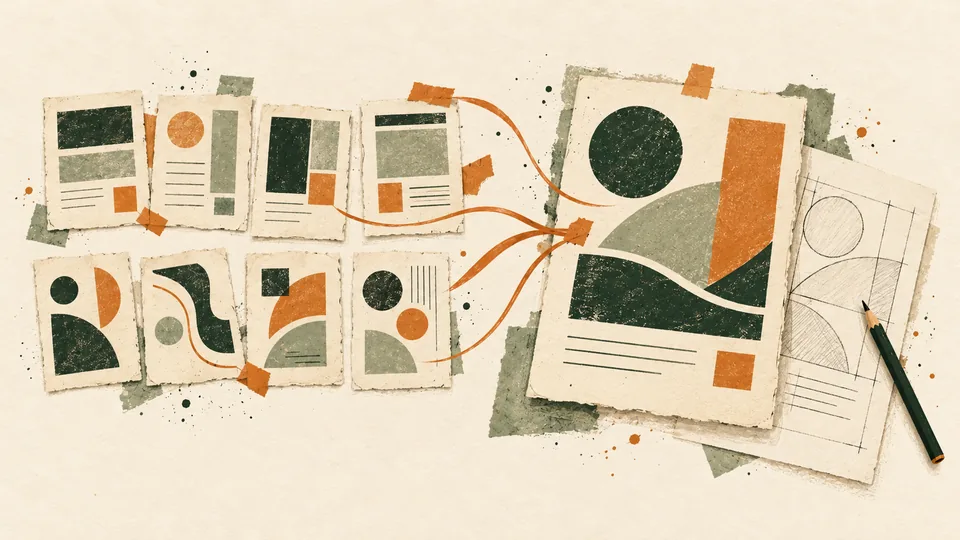
One of the things I've found that makes a big difference in the UI I get from AI is spending some time working through the design with an image-generation model. I want to see a few directions and figure out what I actually like before I ask a coding agent to build the finished interface.
For me, this starts in voice chat. I talk through what I'm trying to build and what I want it to do. I get the first version working from there. It should do what I need, and I keep it as simple as I can. Then I take that version into image generation. My current preference is OpenAI's image generation, and I ask for eight directions: four that stay pretty close to what I have but improve it, and four that are completely different.
Then I pick the parts I like from those images and ask for more versions that combine them. I keep doing that until I have something I really like. Once I have that, the design becomes a spec for the coding agent, and matching that spec becomes part of what it means to finish the work.
I posted about this approach in August. At the time, I described handing the chosen image to Codex or Claude with the instruction, “Build the UI until it looks exactly like this screenshot.” The important part of the handoff is making sure the agent has a clear target and a process that actually checks whether it got there.
I've also had a coordinating agent turn a short conversation into a detailed brief and handoff instructions, with me steering the work. That doesn't mean every task follows the same sequence.
Start by talking through the idea
The examples below are independently written things you could say in voice chat for a fictional reading-list app. They haven't been run or tested, and they're not transcripts of my sessions or internal prompts. The optional written outputs are suggestions for readers to request and review.
Start with what you want to build, why you want it, and the few things it needs to do. If you have screenshots of something you like, bring those into the conversation too:
I keep hearing about books I want to read, and then I forget where I wrote them down. I'd like a little app where I can add the title and author, mark whether I want to read it, am reading it, or finished it, and filter the list. Just for me, so I don't need accounts or social features. I like how easy it is to scan a simple notes list. Can we start with something that simple? Help me work out anything I've missed before we build it.
Optional written structure: a short brief with the reason for the app, its basic behaviors, anything you've ruled out, and questions that still need an answer. Check that it describes what you meant. For this example, decide where the books will be saved and whether they should still be there after a reload before asking for the first version.
Once the behavior is clear, ask for a basic working version:
That sounds right. Go ahead and make the simplest version that does those things. Keep the styling basic for now. I want to try adding a book, changing its status, and filtering the list before we spend time on the design.
Try those actions yourself and check the save behavior you agreed on. If adding a book is awkward or a filter doesn't do what you expected, work through that now. The first version gives you something concrete to react to, and keeping it simple leaves room to explore the appearance without getting attached to styling you've already built.
When the basic flow works, keep screenshots and the agreed behavior together for the design exploration. If you used a written brief, update anything that changed while trying the app. Otherwise, you'll be comparing attractive pictures of the wrong thing.
Ask for four familiar directions and four different ones
The first four give you a chance to improve what you already have. The other four give you room to see something you wouldn't have thought to ask for. Both sets still need to support the same job.
Give image generation the current screenshots and the behavior you agreed on, including your written brief if you made one:
Take this version and show me eight different directions. For four of them, stay pretty close to what I have and improve it. For the other four, go somewhere completely different. Keep the same book information and controls so I can compare them. Label the images so we can talk about which parts I like.
Optional written structure: a comparison sheet with A–D marked as related improvements and E–H as divergent directions, the same fictional content and reference viewport for each, and the required actions. Check that the images really cover different layouts and still support the same job.
The output should give you eight choices you can actually compare. Look at whether you can still find the status controls, read the book information, and understand what to do next. Then look at the visual differences. If all eight use essentially the same layout, the exploration hasn't given you the range you asked for.
You don't need to pick one image as a complete package. You might like the compact rows in B, the typography in F, and the way C makes the current filter obvious. Say or write down those specific preferences so the next round has something useful to work with.
Combine the parts you like
Attach the images you're referring to when you ask for another round. The labels help keep the conversation precise, but the model also needs to see the actual choices.
I like the compact rows in B, the typography in F, and the way C shows the filter. Can you give me four more versions that combine those parts? Keep the reading-status controls easy to find. If some of those choices don't work together, tell me what's getting in the way.
Optional written structure: a list of the selected aspects, their source images, and any unresolved conflicts. Keep that list with the next round of images so you can check that the parts you chose survived.
Use preferences you can point to in the images you received.
Check whether the next round actually keeps the parts you liked. You can repeat the process, keeping what works and being specific about what still feels wrong. Once you choose a design, keep that image and the decisions that led to it together. That gives the implementation agent a stable target instead of a long conversation full of discarded directions.
Turn the chosen design into a spec
A screenshot gives the agent a visual target, but it doesn't show every requirement. It doesn't tell you what happens when the list is empty, what a validation error says, how keyboard focus moves through a form, or how a long title wraps on a phone.
The spec should connect the chosen appearance to the behavior you've already established. Give the agent the selected image, the agreed behavior, and the decisions from the design rounds. Include the written brief if you made one:
This is the one I want to build. Can you turn it into a spec for the coding agent? Keep the things the app already does. Work through what happens on a phone, with an empty list, or when I enter something wrong. Include keyboard use too. Separate what we decided from anything you still need me to answer.
Optional written structure: the selected reference image plus layout, typography, spacing, colors, component states, responsive rules, keyboard access, visible focus, labels, and non-color state cues. Separate established behavior, proposed decisions, and open questions. Turn the agreed requirements into observable acceptance criteria before coding.
Review the open questions before handing off implementation. If the image has a control whose purpose nobody has decided, give it a real purpose or remove it. If a mobile layout wasn't part of the exploration, choose how it should work instead of treating a squeezed desktop screenshot as the mobile design.
The output you carry forward is the chosen image plus an agreed spec. Keep the image's dimensions with it, and identify the screen sizes and states you'll check. That makes the visual comparison meaningful without pretending the image answers every product question.
Make matching the spec part of being done
Whatever process you use for the coding work, whether that's QA, a goal session, or something else, the agent needs to know that the goal isn't complete until the implementation matches the spec.
For the fictional reading-list app, you could say this when handing off implementation and review:
Build this design using the spec we agreed on. Don't call it finished just because the buttons work. Compare it with the image, check the different screen sizes and states, and try the actual reading-list flow. Show me what matches and what still needs work. If two requirements conflict, bring that back instead of quietly changing the design.
Optional written structure: a review checklist tied to the chosen image and agreed spec. Compare the same populated state at the reference viewport; check narrow screens, long titles, empty/error states, adding a book, changing status, filtering, and keyboard use. Record evidence and remaining mismatches. An unperformed check stays unperformed.
A matching screenshot is one piece of evidence. The controls still have to work, the narrow layout still has to be usable, and someone using a keyboard still has to be able to complete the task. Visual comparison can help you notice spacing or hierarchy problems, but it won't establish those other things by itself.
I want the creative exploration to leave me with something I actually like, and I want the coding agent working toward that specific result. That's been the key for me: work through the different directions, choose the parts that fit, and carry that decision all the way through implementation and review.